The world of web design moves fast. We’ve seen trends come and go, but it’s hard to predict which trends will dominate in 2022. In this article, we’ve outlined some of the most popular design trends that have emerged over the last few months.
3D modelling

3D modelling is a technology that allows you to create 3D models. A 3D model is an object made up of polygons, which are geometric shapes with sides and angles. The process of creating these shapes involves breaking down a real-life object into its basic forms then combining those forms to create a three dimensional version. This technology is used in many industries such as animation, architecture, engineering and more!
3D modelling is used by designers, architects and engineers to design any structure from buildings to bridges or even cars! It can also be used for games or movies that use virtual reality headsets like the Oculus Rift (VR).
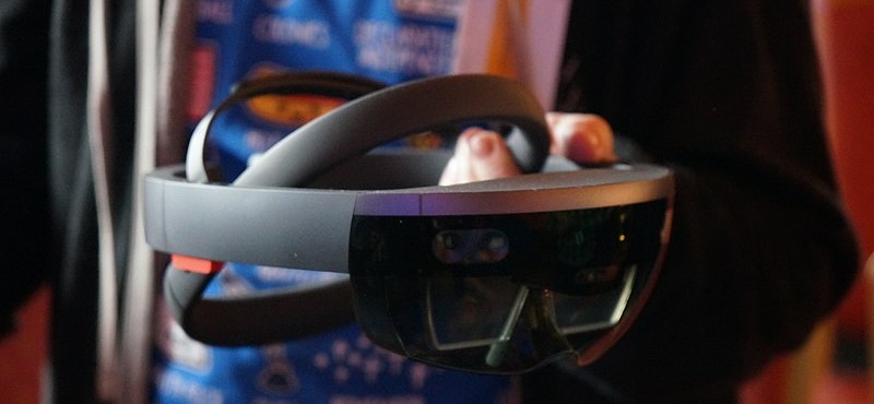
Augmented reality
The future of web design is augmented reality. The concept has been around since the Apollo era, with science fiction authors predicting it in their works decades ago. Now, thanks to advancements in technology and a growing number of users who have headsets such as Google Cardboard or Microsoft HoloLens, augmented reality has finally entered the mainstream.
Voice interface
Voice interface is a new way to interact with your website. It is a great way to improve customer experience and reduce the number of clicks required by the user. Voice interfaces can also increase conversion rates.
Designing for the brain
When you’re designing an interface, one of the most important things to keep in mind is that people have different mental models. If you want your product to be used by a wide range of customers and users, then it’s vital that you understand their mental models before creating your interface. This means knowing what kinds of problems they’re trying to solve and how they go about solving them.

For example, if someone is looking for information on how to make breakfast burritos, they might start by searching Google for “how do I make breakfast burritos?” On the other hand, if another person’s only goal was to get some protein into their diet but didn’t care about making burritos or cooking steak specifically, then she might search Google for “what’s the best way for me to get more protein into my diet?”
In both cases we see different uses—one is focused on cooking while another wants general nutritional advice—but both illustrate how users approach their tasks differently depending on what goals align with their personal needs and preferences. By understanding these different approaches when designing interfaces for products, companies can create interfaces that support specific goals while also remaining easy-to-use overall.
Mobile first approach
The mobile-first design approach is about designing for small screens, and then optimising your designs for desktop. This means that you need to make sure that your site works well on mobile because most of your audience will be accessing it from their phones or tablets. The point of this strategy is to prioritise content and functionality over flashy designs and animations because those take up a lot of space on smaller screens. You should also avoid using too many fonts or colours that can slow down load time, as well as limiting the amount of content you have on each page so it’s easier for users with slower connections to download quickly.